Image element
Get to know the image element in detail.
The image element allows you to upload custom images to your snap and adjust them in various ways. There’s also a library of Static Images to quickly use commonly used images.
Adding an image from library
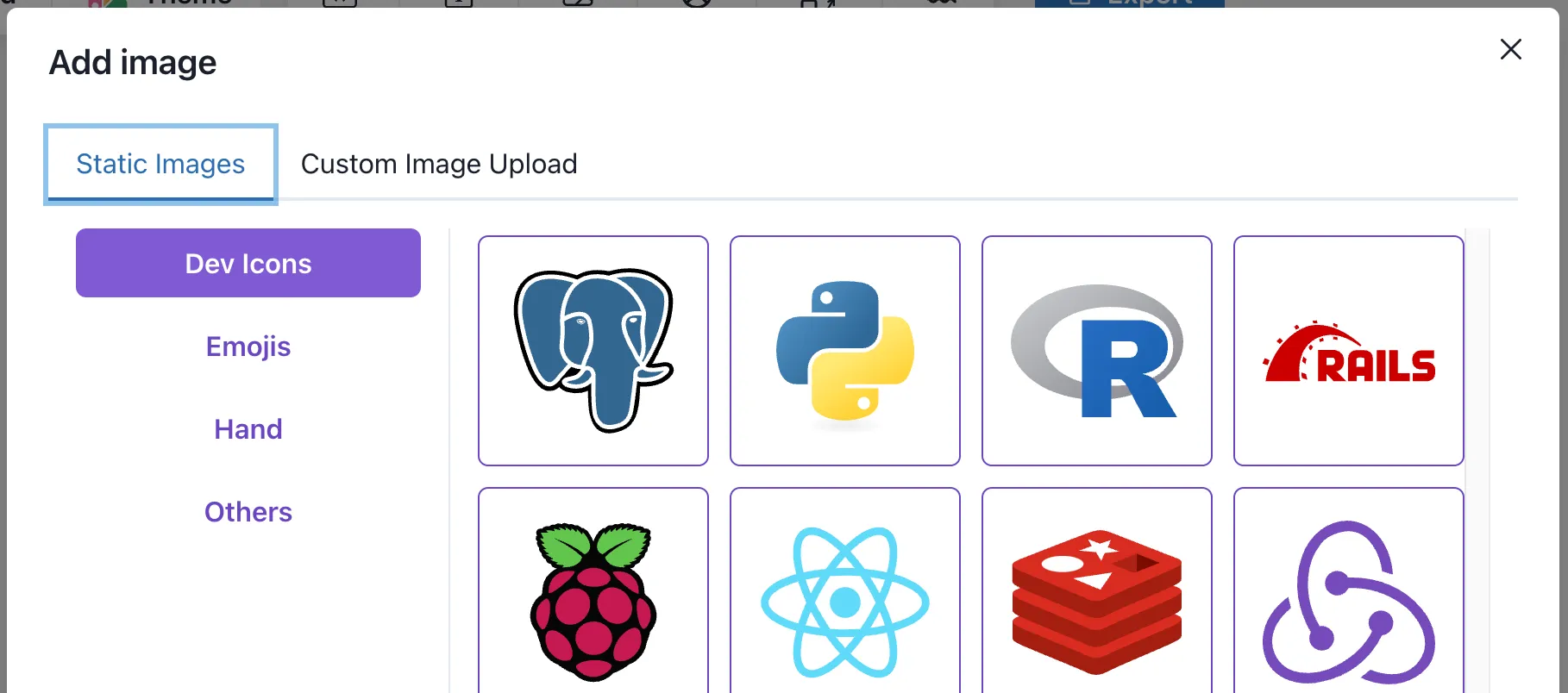
Clicking the “Add Media” button will open a modal with different categories of handpicked images, such as Logos and Emojis. Just click on the image you want to add and it will be added to your snap.

Adding a custom image
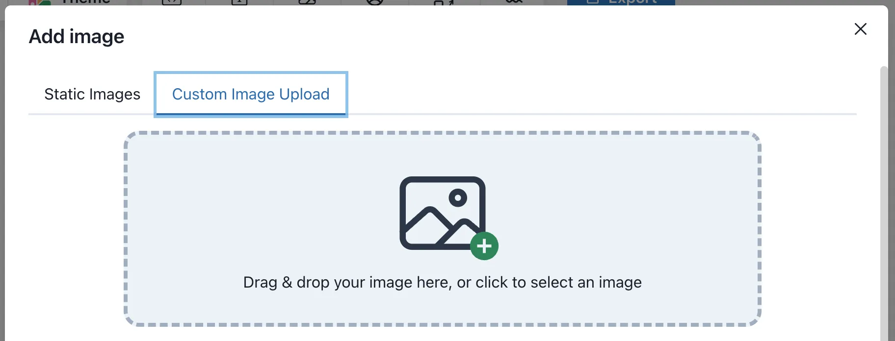
On the second tab you can upload your own image. Simply drag and drop the image to the upload area or click on it to open a file picker.

Below the upload area you can see the recently uploaded images. Clicking on one of them will add it to your snap.
Right toolbar
Let’s have a look at the right toolbar and what you can configure there.
Image description
To ensure that your snap is accessible to all users, it’s important to add a brief but descriptive text to the image.
This will be used as the alt attribute of the image when it is shared via a direct link or embedded on other websites.
On this way you can help users with visual impairments or those who use screen readers to understand the content of your snap.
Replacing an image
You can replace any image on the snap by accessing the image categories on the right toolbar and selecting a new image from there. By default the current selected image category will be expanded.
Advanced Styles
The image elements supports the following advanced styles:
- Opacity
- Blur
- Rotation
- Tilting
- Border-radius (default: 8px)
- Shadow
- Grayscale
- Sepia
- Hue rotation
PRO Tip 💡
To create more sophisticated designs, you can apply 3D rotation (tilting), to the image element.
View a DEMO to see how it looks like.
Element Tree (Left toolbar)
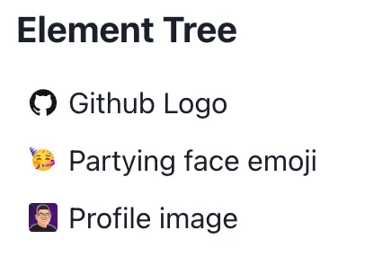
The image elements will be displayed with a small preview of the image itself. If a description text is provided, it will be used as label for the element. However, you can still rename the element by double-clicking it.
